Similar to my research article here on the topic of Ultimate Frisbee player value, I feel it’s probably necessary to begin with a brief introduction on Disc Golf for the uninitiated. Most are familiar with the sport of Golf, and if one knows the basics of that sport they are most of the way there with Disc Golf as well. Disc golfers “tee off”, or “drive”, put shots down the “fairway”, and “chip” (in disc golf, more commonly “throw an upshot”) onto the “green”, where they can attempt to make a “putt” for “eagle”, “birdie”, “par”, “bogey”, “double bogey”, etc. The main difference is the equipment; disc golf is played with a flying disc, or set of flying discs similar to those used in Ultimate, but smaller and more aerodynamic. Golf discs can fly twice as far as Ultimate discs with similar effort, due to their thinner, more aerodynamic shape. Discs made for catching, like Ultimate discs, are sometimes called “lids” because of their blunt edge. The putters in disc golf resemble “lids” a little bit, but discs that are intended to fly further, like midranges (similar to irons in golf), and drivers especially have more tapered leading edges to allow the disc to cut through the air. Instead of a cup in the ground, the target for every disc golf hole is a specially designed metal basket sitting on a pole, with chains hanging down from a circular band above the basket. The chains absorb the momentum of the disc, dropping it into the cage below.
Ever since I began playing disc golf, and keeping track of my scores and statistics via the UDisc app, I’ve wondered at the best way to model score. UDisc keeps a comprehensive set of statistics for every round a player enters, which deserve an explanation below:
* Fairway%: The percentage of drives a player lands on the fairway (or green), rather than in the rough or OB.
* C1x%: The percentage of putts made inside “Circle 1”, which is the 10 meter circle surrounding the basket, excluding the putts attempted inside 11 feet, which are considered “tap-ins”
* C2%: The percentage of putts made inside “Circle 2”, which doesn’t actually exist within the rule book, but which UDisc has defined as the percentage of putts made between 10-20 meters. Putts outside Circle 1 are governed by different rules than putts inside the circle, but experienced players are still largely using their putting form rather than their throwing form within 20m, so this statistic was created to track those longer putt attempts.
* GIRC1%: This stands for “Green in Regulation Percentage (Circle 1)”, and it tracks the percentage of holes in which a player reaches the green, or in this case specifically Circle 1 inside the green, in “regulation”, or in other words with a shot at birdie. In practice, this means a GIRC1 hit would be landing a disc in Circle 1 off the tee on a par three, or on the second shot on a par 4, etc.
* GIRC2%: Much like GIRC1%, except this tracks the green as a whole, in other words C1 and C2. GIRC2% will always be at least as high as GIRC1%, because every GIRC1 hit is also a GIRC2 hit - but not vice versa.
* Parked%: Again like the above, except counting only shots landing in the 11 foot “bullseye” zone around the basket, in few enough shots to leave a tap-in for birdie or better.
* Scramble%: The percentage of holes in which a player throws OB or off the fairway at some point, but still makes par or better.
Very quickly I found myself wondering: which of these metrics, if any, were predictive of a good score? This seemed like an excellent application of a good old linear regression, so I went about finding some data. I had data of my own creation, from rounds that I had played, but I ruled that out. The same factors that influence my scores would probably influence everyone’s scores, but I couldn’t be sure, and if I wanted something to be generally predictive ideally I would have data from a variety of players. Another factor is that I am still very bad at disc golf, and if I wanted to know fundamental truths about the sport it would probably be best to look for data from those playing it with skill and polish.
Luckily for me, UDisc tracks and publishes statistics from elite disc golf events. I picked at random 55 MPO player seasons from across 2018, 2019, and 2020, in order to get a range of samples from the best and worst players on tour. I debated picking samples from the MPO and FPO fields, but I think it’s a bit of an open question for me whether combining the two divisions’ data would yield the most informative model, or whether a different model would be needed for each division. It’s worth investigating in the future, but as my main goal was to model my own play and at the very least I can aspire to be an MPO player, I decided to stick with MPO for now. For each of these players I had all the statistics I outlined above and more, and for the response variable I calculated something I called “Score9”:
What this statistic gives is a player’s average score per 9 holes played in these elite events. I didn’t have access directly to that information, but because I had these percentages for hole results, I could multiply each percentage by that outcome’s effect on the player’s score (e.g. multiplying a birdie by -1), to arrive at a player’s score per 100 holes. Then all I needed to do was divide by 100 to get score per hole, and multiply by 9. Traditionally golf is played over 18 holes, but I like to work in 9 hole increments because some small courses are only 9 holes long, and I’d rather track a round at an 18 hole course as two rounds back to back, rather than track rounds at 9 hole courses as half of a round. It’s worth saying that this data is not perfect - there’s some potential for bias in that any scores over triple bogey are bundled into the “Triple Bogey+%” bucket, and scores under eagle I made the decision myself to bundle into a sort of “Eagle-%” bucket. However, scores over triple bogey are so rare for players at this level, and scores under eagle so rare in general, that I didn’t think it would be a serious detriment to the accuracy of the data set.
I ran single variable regressions with every explanatory variable I had, and three jumped out as the best candidates, in terms of their statistical significance, explanatory power, and intuitive importance - and also lack of collinearity with one another: GIRC1%, C1x%, and Scramble%.
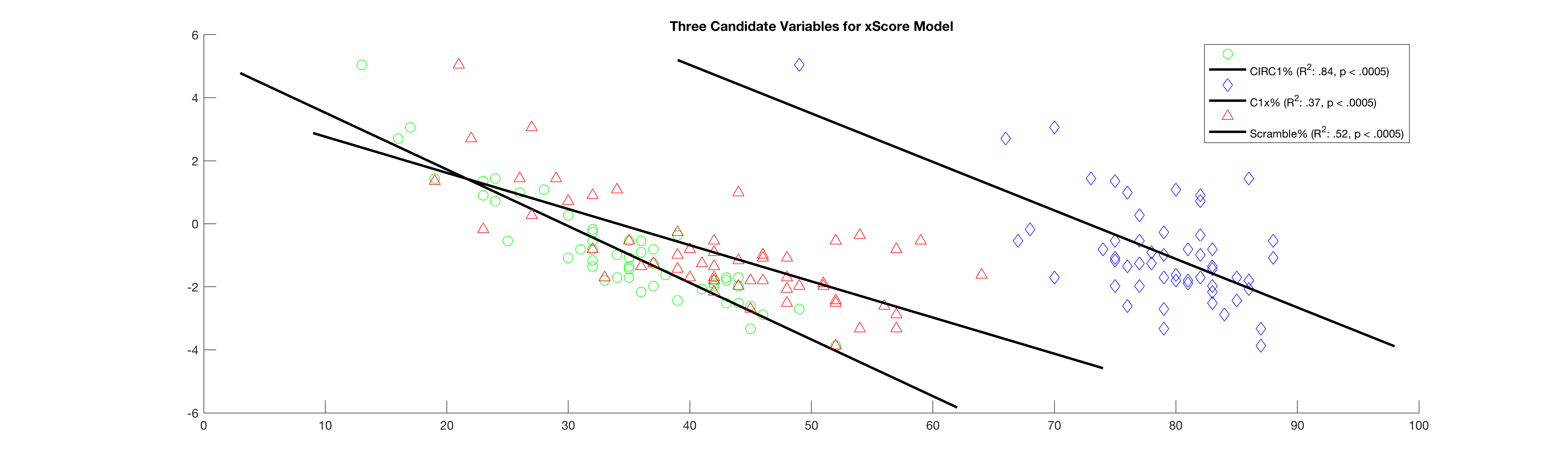
Figure 1: Plotting Score9 vs three candidate explanatory variables: GIRC1x%, C1x%, and Scramble%
Here are three excellent candidates for our model, with varying degrees of excellence. GIRC1% is the clear standout, with both a high degree of significance and a very high amount of explanatory power. This makes good intuitive sense too, in terms of game mechanics: the vast majority of professional players are competent putters within the circle, and assuming that the mean distance from the basket on circle 1 hits will probably be somewhere around 16 feet, making circle 1 in regulation at the pro level is an almost guaranteed birdie. Next up in explanatory power is Scramble%, which has a more moderate R2, but still plenty of significance, and likewise C1x%, which has even less explanatory power. This finding, that Circle 1 putting explains far less scoring variability than driving or even scrambling, may come as a surprise to some - given the frequently cited maxim: “drive for show, putt for dough”, and the ubiquity of the notion that excellent putting is essential to compete. However, it echoes the findings of this Ultiworld Disc Golf article from 2019, which came to a similar conclusion.
I clearly had some good variables to work with, so I set about creating models to best fit the data.
Score9 = GIRC1x% + 1
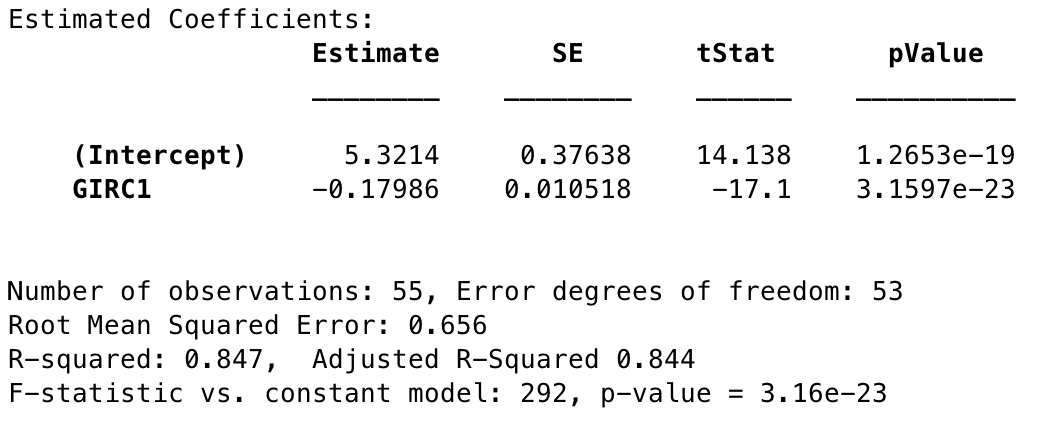
Figure 2: Statistics for Baseline GIR C1 model
Since this variable alone had such a high R2 already, I decided to give it a try as a candidate model. At first glance it looks fine, good in fact, but the residuals do show some patterns that indicate the presence of other explanatory variables. In particular, plotting the residuals for this model against Scramble% produces a very clear linear relationship. This may work as a baseline by which to compare other models, but definitely shouldn’t be the stopping point here.
Score9 = GIRC1x% + C1x% + 1
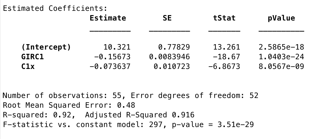
Figure 3: Statistics for Model 1
Interestingly, even though my residuals investigation showed that Scramble% should be able to explain the error present in the prior model, when I brought another variable into the mix by far the more significant of the two remaining was C1x%. In fact, this is one of the more powerful-appearing models that I found, both in significance and in explanatory strength. The residuals appeared to be solid for this model, so regardless of my confusion around it this seemed like a strong candidate.
Score9 = GIRC1x% + C1x% + Scramble% + 1
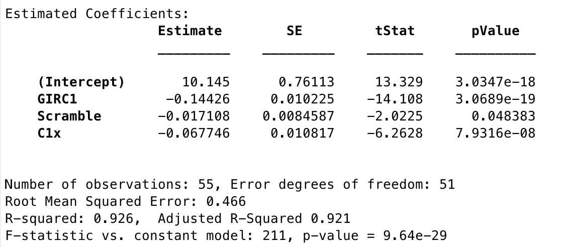
Figure 3: Statistics for Model 2
Adding Scramble% in does bump up the Adjusted R2, from the previous model, and it also more than doubles (halves) the overall p value of the previous model. These are both good signs, though it is a little disconcerting that Scramble% is barely under the significance threshold. Intuitively these are three important factors in disc golf performance, but there is also the tenet in modeling that if a simpler model can perform as well or almost as well as a more complex one, it is always better to keep it simple. Both sets of residuals are decent, so the choice between models 1 and 2 is truly a tough one, at least to me. However, there is one more model in play.
Score9 = GIRC1x% * Scramble% + 1
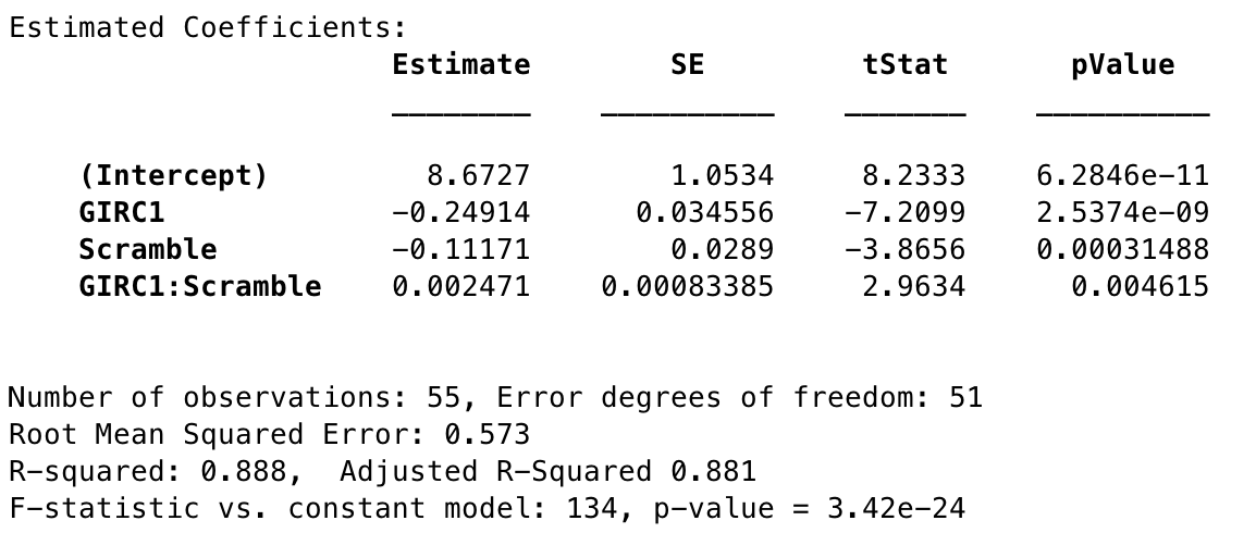
Figure 4: Statistics for Model 3
The last model I came up with models the interaction effects between GIRC1% and Scramble%. The first tell that such an effect existed was in Figure 1, seeing how the slopes of the two variables are not parallel, but this confirms that it’s more than chance. What makes this model especially compelling is that it makes complete sense that there would be an interaction between these two variables: If a player is driving the green frequently, a low scramble rate may not be a sign that the player is doing very poorly; they may have simply not had many chances to scramble. If a player is doing very poorly in GIRC1% a high scramble rate may save them excessively high scores, but at the same time most of those scrambles will likely be for par, not birdie. I plotted this model below (Figure 5), and it demonstrates this interaction with the following general behavior:
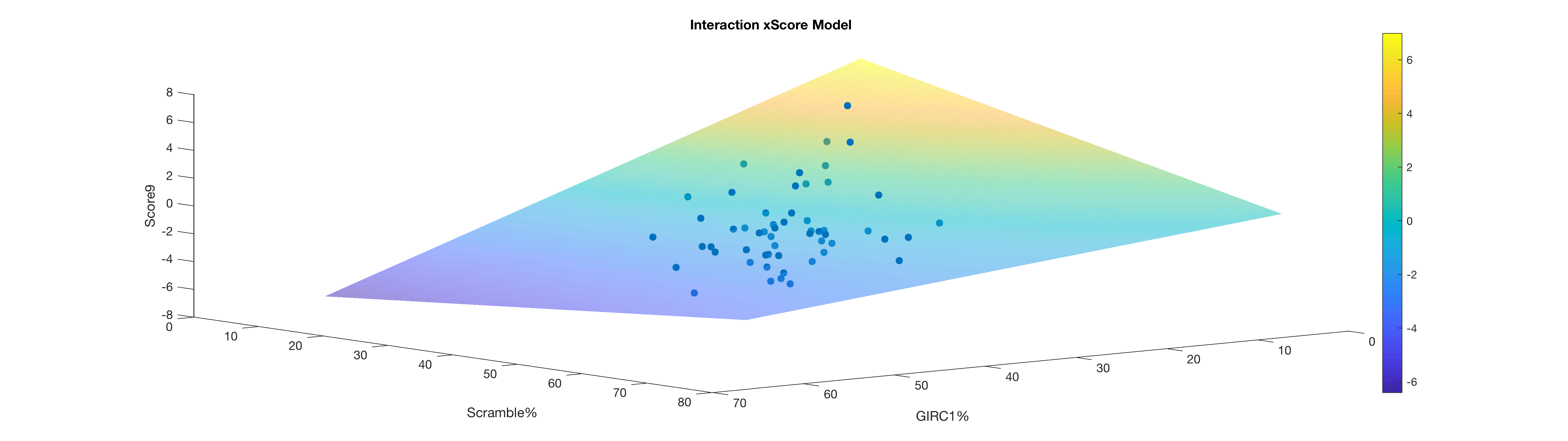
Figure 5: Plot of the the interaction model (Model 3)
* Low GIRC1% + low Scramble% = highest score
* Low GIRC1% + high Scramble% = high medium score
* High GIRC1% + high Scramble% = low medium score
* High GIRC1% + low Scramble% = lowest score
It’s probably worth noting that on a round to round basis, this is not how the scores would work; all else being equal a successful scramble is better than an unsuccessful scramble. What confounds things a bit is that perfect scramble performance is not 100%, but 0/0. A chance to scramble only comes into play because of a mistake, so even great scrambling implies imperfect play. Again, if given the chance to scramble it is always better to do it successfully, but I think it does say something that on average, over the course of the season, the very best players do not necessarily have the very best scramble rates. The very least you can say is that in terms of scrambling a small sample size is better, and small sample sizes can mean volatile statistics.
As for the model statistics, we can see that this model, convincing though it is, does seem to fare worse in terms of p value and R2. the R2 explains only about 2% less variance than Model 1, but most of the variable p values are much higher, and the model’s p value is far higher than that of Models 1 and 2. Two points in Model 3’s favor, however, and big ones, are that A) the residual plots look cleaner and more even, and B) if there is a significant interaction effect in the data, it’s not a good idea to ignore it - which at least calls Model 2 into question. If I were to choose between the three, the statistically responsible thing to do would probably be to go with this interaction model, given the more trustworthy error spread, good theoretical grounding in the mechanics of the game, and the fact that gaudy p and R2 values can come about in all kinds of misleading ways.
To get a better sense of these models, I started testing them in various ways against new data. One way to test the quality of these models is to see how they correlate with events which aren’t part of the training data - for which I used the 2021 elite events up to this point. It would have been nice to use a full subsequent season’s data, but at this point in the tour they’ve played enough of a variety of courses and course types that I think using a partial season won’t change the outcome too much. I’ve compiled the UDisc stats for every MPO player’s Elite Series season in 2021 (minimum 180 holes), and below are the correlations between each player’s actual Score9 so far, and the expected Score9 by way of each candidate model:
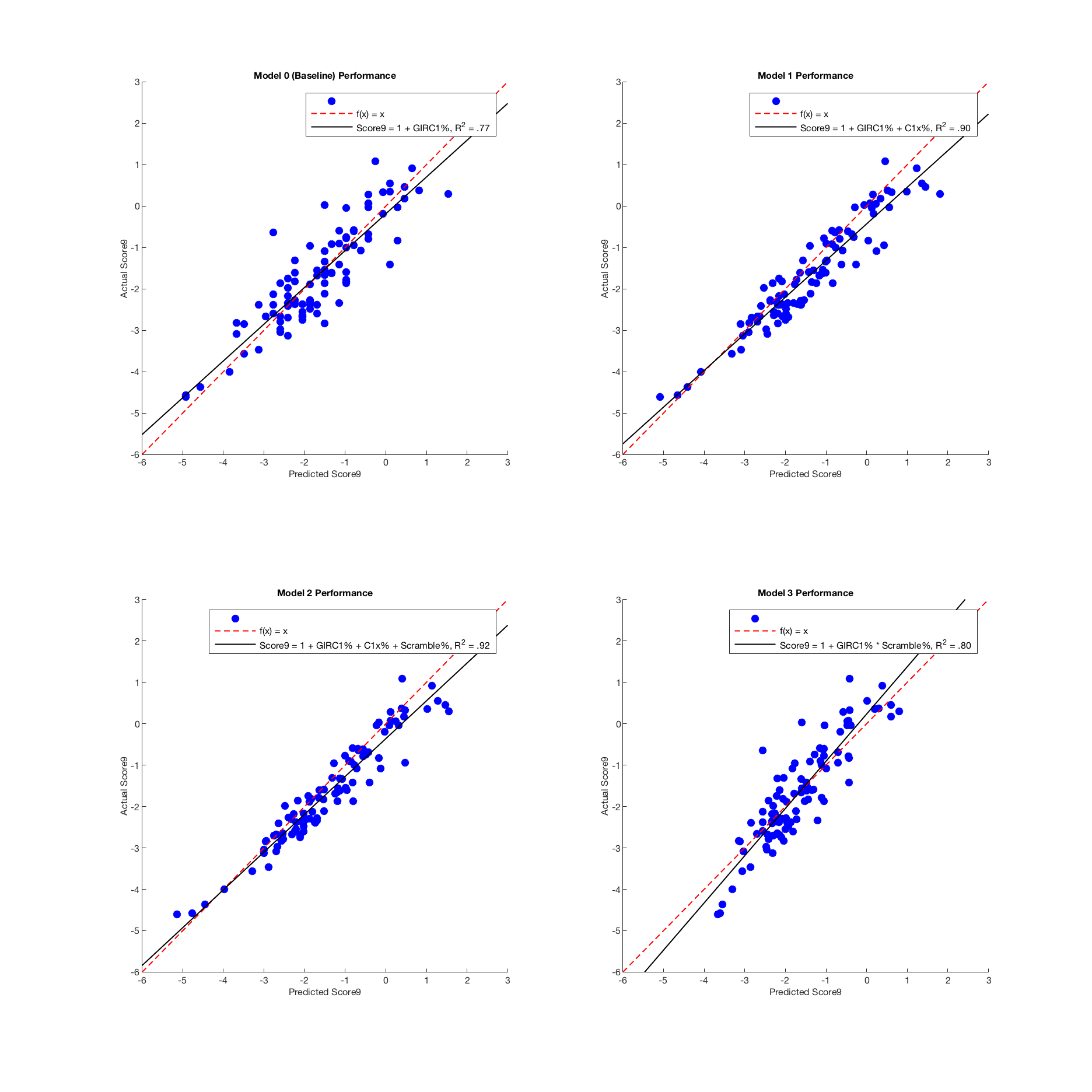
Figure 6: Correlation between predicted and actual Score9 from 2021 player statistics
Each one of the more involved models outperforms the baseline model here, which is good - but Model 3 does so only barely. Clearly out in front here are Models 1 and 2, both fitting the data extremely well. The only thing that makes me slightly nervous is that typically a regressed model will have a more conservative outlook, basically predicting exceptional performances to regress slightly towards the mean. Model 3 does show this behavior, predicting very good scores to be slightly worse and very bad scores to be slightly better - but Models 0, 1 and 2 all actually trend towards the more extreme. This is interesting, though I’m not sure exactly what to make of it.
I thought next to check how they fared predicting future player performance. In baseball, statistics like FIP, or Fielding Independent Pitching, (though not designed to be predictive) are known to be better “estimators” of a pitcher’s performance than the actual runs the pitcher allows because they do a better job at predicting a pitcher’s future runs allowed than the runs the pitcher has allowed in the past. So for instance, a pitcher’s Earned Run Average in year x will typically correlate decently with their ERA in year x+1, but their FIP in year x will correlate much better with ERA in year x+1 (for more on this relationship, I have an article about my own tinkerings with FIP here). This is my idea with xScore: we know now that we have a very good sense of which variables affect a player’s score, but a good predictive model based on these variables should at the very least outperform a player’s past performances as a predictor of future performance.
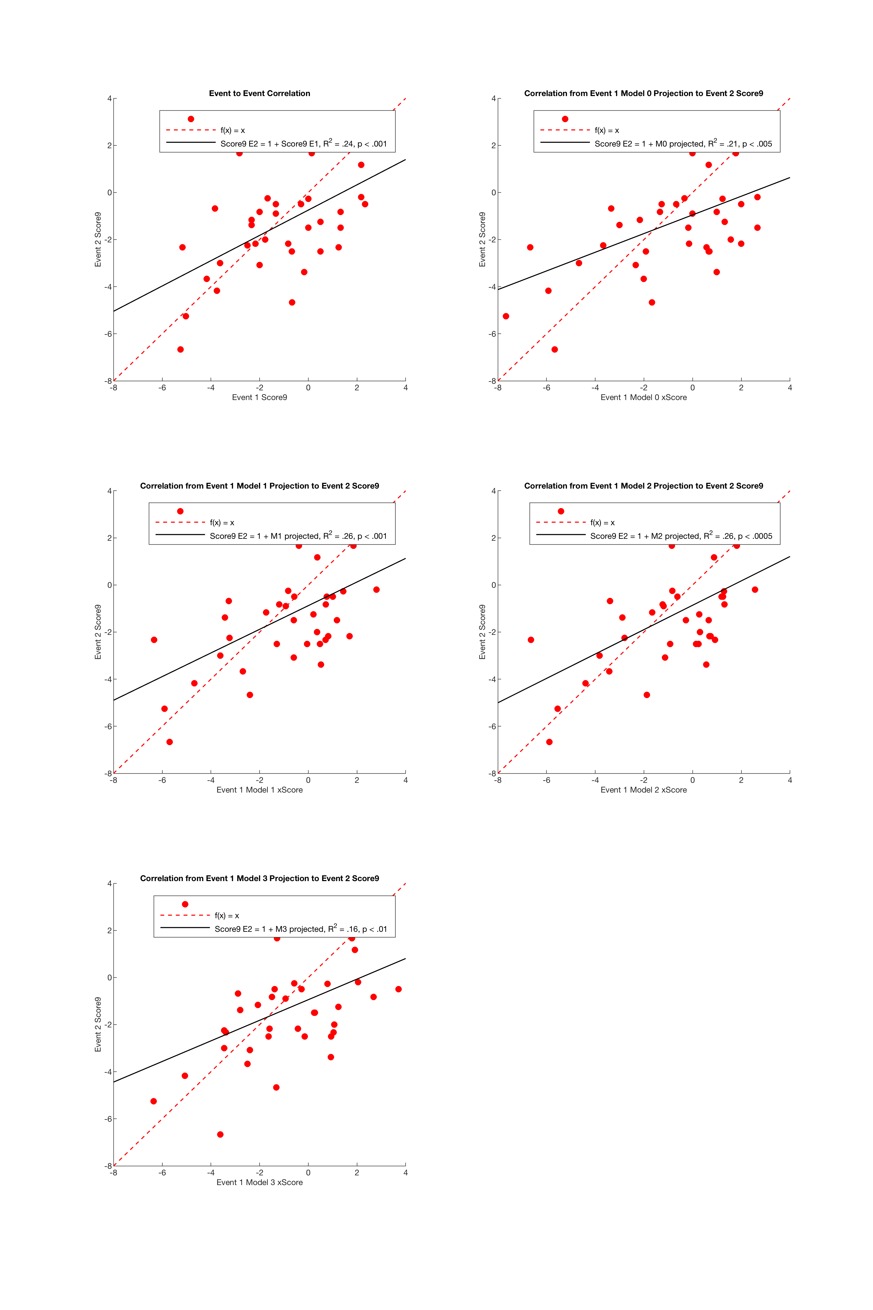
Figure 7: Correlation between predicted Score9 from a given event against actual Score9 from the following event
It’s no surprise there’s so little correlation between these variables. Some of these players may have made tweaks or changes between events, may have been feeling better or worse, may play better or worse intrinsically at one of the courses - there’s a lot of potential for noise here. However, it isn’t ideal that even the best-performing models only cleared the baseline by 2%. I think what this tells us is that if there is predictive potential in these models (and I would think, given their extremely high degree of significance and explanatory power that there would be, all else being equal), this may not be the best way to see it in action.
I devised one more test of the models’ performance, and if any of them would allow us to compare the models’ performance I should think it would be this one. I picked random players from the 2020 Ledgestone Insurance Open, and for those players I picked a random pair of consecutive rounds. Ledgestone is a very well-rounded course, having both long, open holes where wind comes into play, and wooded technical holes, so it shouldn’t be biased against any one type of player. Picking consecutive rounds from the same weekend should capture a player at a roughly constant level of ability. With as many confounding factors as possible eliminated, I hoped the models would see through any bad breaks the players in the dataset may have had, using their regressed scoring performances in one round to predict their scores in the next.
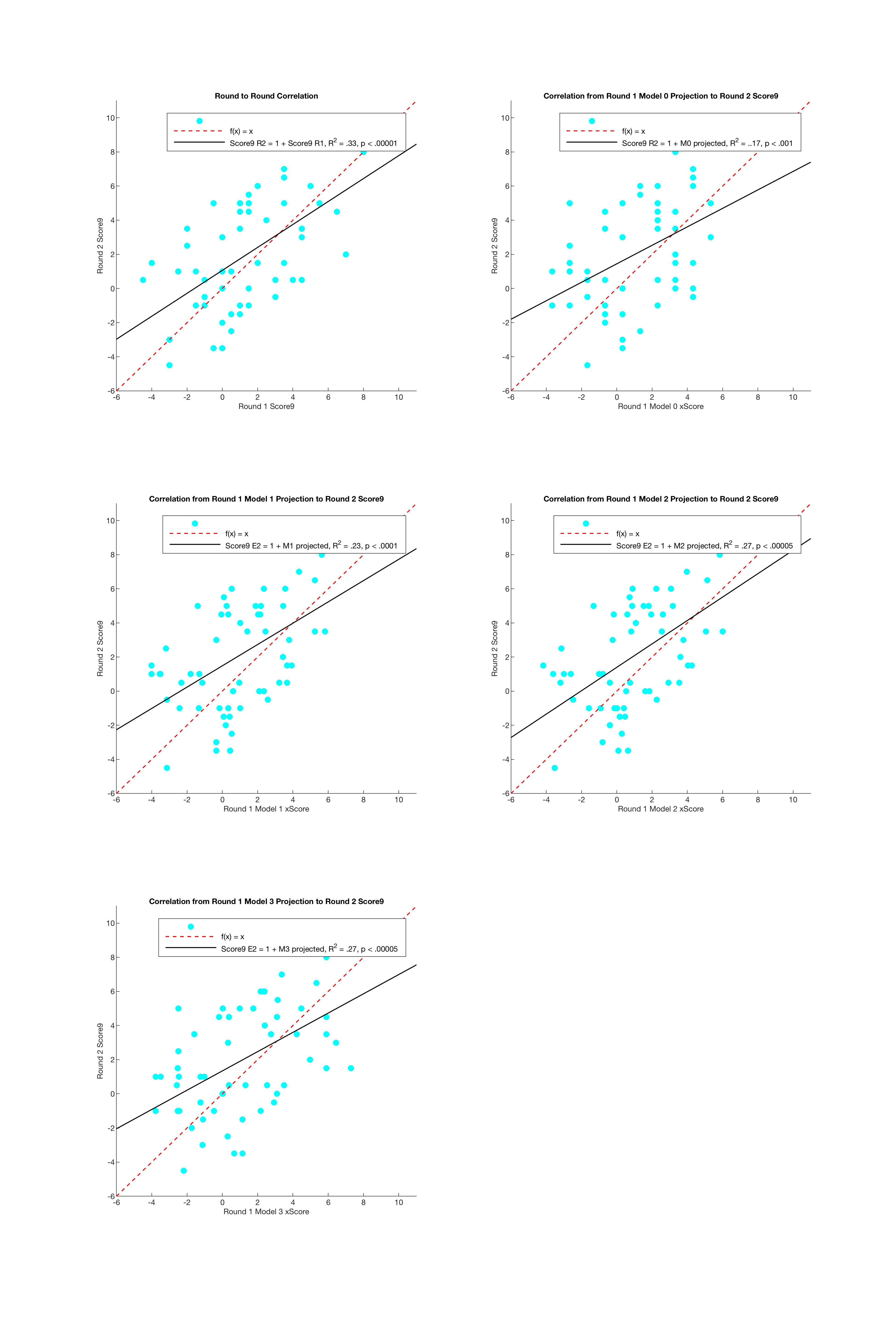
Figure 8: Correlation between predicted Score9 from a given round against actual Score9 from the following round, at the 2020 Ledgestone Insurance Open
This is a better result than my last test, but unfortunately, I think all of this shows pretty definitively that I did not come up with any predictive models. This is a little strange to me, as all of the variables I chose demonstrated a moderate to high R2, but then again it’s possible that I simply did not find the right context to demonstrate predictiveness.
To circle back on the utility of all this, the purpose of a predictive model of score is to separate results from underlying ability. Every sport is subject to luck - good or bad breaks - and as a result player performances can often be unpredictable game to game, or round to round. However, underlying these results can often be found attributes of a player’s performance that don’t fluctuate - such as, to use another baseball example, hard hit rate. Reality is a little more complicated than this, but in general if a good player goes a few games without a hit, but still smokes the ball in those hitless games, they are probably just the victim of some bad luck, and can most likely be expected to be just fine. On the flip side, if the player demonstrates a significant drop in hard hit rate, something may be amiss. We can say all of this because A) hard hit rate has been shown to correlate with batter success and B) it is not a very volatile statistic - it stabilizes quickly and is a reliable indicator of a real skill.
Ideally, we could find something similar for disc golf. A player’s scores round to round, and event to event are clearly extremely volatile, but it stands to reason that if the best players remain the best players, they must be demonstrating certain skills on a consistent basis - and if there is a way for these skills to be quantified, one would think that they would be useful in predicting player performance.
It’s possible that the variables simply fluctuate too much. When I conducted the last experiment, and attempted to use statistics from one round to predict scores from the next, I assumed that players would remain at the same underlying ability level from one round to the next. It seems intuitive that they might, at least more likely than that they would remain at the same level from weekend to weekend, but it could still for whatever reason be untrue. Disc golf can be filled with bad luck, and it’s possible that even the statistics UDisc tracks are too obscured by course luck.
That is to say, there could be underlying abilities underlying even these “underlying abilities”. It’s hard to imagine what those may be, given the vastly differing demands of each different and unique hole, but as an example something like disc release velocity - some attribute that is truly fully in the player’s control.
More work clearly needs to be done to find a model that can be used to project player performance, but that does not mean this was fruitless. We may not have a predictive model, but we do have two excellent theoretical models here, both showing a high degree of significance and explanatory power. Model 1 uses GIR C1% and circle 1 putting to predict scoring, and Model 3 uses the interaction between GIR C1% and scramble rate - two very different approaches that make a lot of sense. Ideally these approaches could be combined somehow, but that will have to wait for another time.